
Now that colour company PANTONE has chosen ‘Classic Blue’ as the 2020 Colour of the Year, we take a closer look at what it will mean for architects, homeowners and fenestration installers
How do you feel about the new decade that we’ve just entered? Hopeful? Excited? Worried? Uncertain? Thankfully 2020’s colour of the year is a solid and dependable hue you can rely on.
Out of the blue
Since American colour company Pantone first started choosing its ‘Colour of The Year’ at the beginning of the new millennium, there have been some exotic choices. From Fuchsia Rose in 2001 and tangerine tango in 2012 to Ultra Violet in 2018 and Living Coral in 2019.
But as we enter the new decade of the 2020s, rather unexpectedly, Pantone have plumped for Classic Blue, in a bid to reflect the desire for a dependable and stable foundation on which to build as we enter a new era.
Leatrice Eisemann, executive director of the Pantone Colour Institute explains why: “We are in a time that requires trust and faith. It is this kind of constancy and confidence that is expressed by PANTONE 19-4052 Classic Blue, a solid and dependable blue hue we can always rely on. Imbued with a deep resonance, Classic Blue provides an anchoring foundation. A boundless blue evocative of the vast and infinite evening sky, Classic Blue encourages us to look beyond the obvious to expand our thinking; challenging us to think more deeply, increase our perspective and open the flow of communication.”
That’s a lot for one colour to achieve! But here at Senior Architectural Systems we know it’s absolutely possible.
Senior Blue
You see blue has always been an important colour for Senior. It is a big part of our distinctive logo and the colour of the cabs on our fleet of Mercedes Benz trucks. The blue we use is PANTONE PMS 287 which is very similar to 2020’s Colour of the Year Classic Blue, both are a medium dark shade of cyan-blue.
We chose it to let customers know that they can trust, depend and rely on Senior’s products, service and people. That trust is what keeps customers coming back time after time and is why we have doubled in size over the last decade. You could say that it has also helped us to expand our thinking and come up with innovative products like our patented ultra-energy-efficient PURe® range of aluminium windows and doors. Environmentally sound, readily sustainable and the certain future of aluminium fenestration.
Architectural Blueprint for design success
So, what will Classic Blue mean for architectural design? Based on past years, whatever colour PANTONE choose as their ‘Colour of the Year’, somehow manages to infiltrate everything from clothes and shoes, to wallpaper, paint and home furnishings. In fact, it plays a large part in many new designs and that includes buildings.
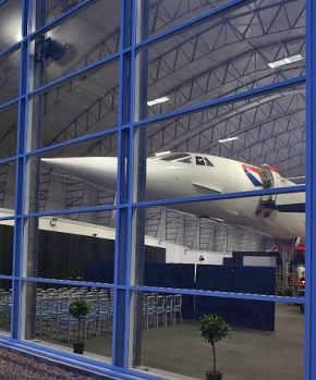
An easy way for architects to incorporate Classic Blue into their 2020 designs is via the building’s glazing system. Specifying Classic Blue for window and door frames, or for curtain wall infill panels can create a dramatic look which will draw attention to the building and what’s inside. That’s exactly what was specified for the Aviation Park in London, to draw attention to the Concord airplane on display inside.
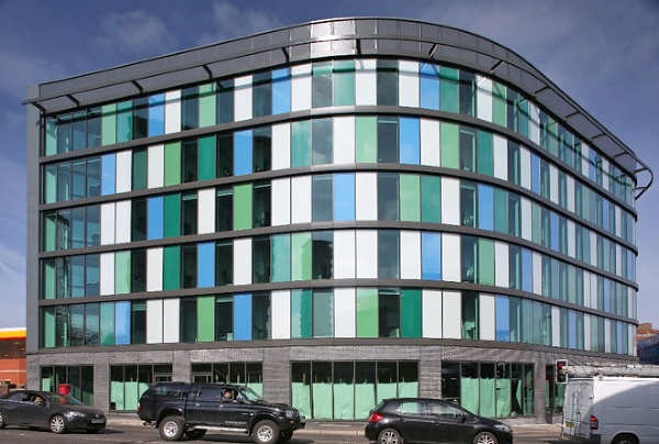
Meanwhile, Blue and green infill panels specified at London Court Apartments in Sheffield give this modern block of student accommodation a striking façade.
Blue sky thinking for homeowners
After a decade of grey décor, the environmentally aware new world of the 2020’s is poised to see more of nature’s colours injected into homes across the land. Whilst PANTONE have gone for classic Blue, suggestive of the sky at dusk, several paint companies have gone for a green theme to reflect the natural landscape. Dulux have announced “Tranquil Dawn” a subtle shade of green as their Colour of the year whilst Graham & Brown opted for “Adeline” a rich bottle-green and Farrow and Ball have introduced deep Duck Green and earthy, organic Sap Green.
In keeping with the trend, Senior’s Signature Colour Range for its domestic Aluminium window and door frame includes a deep ‘Parisian Blue’, a light metallic blue ‘Glacial Spark’ and a timeless ‘Heritage Sage’.
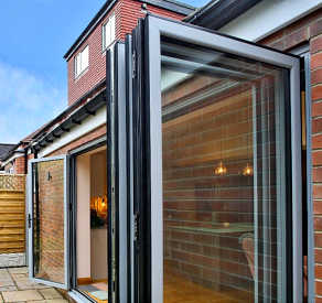
Our popular ultra-energy efficient bifold PURe® Aluminium doors in Glacial Spark
Into the wide blue yonder with fabricators and installers
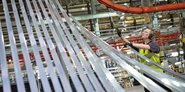
The good news for fabricators and installers is that we can powder coat any of our energy efficient windows, doors and curtain walling in whatever colour their clients and customers choose. That includes any of the RAL colours as well as our Signature Colour Range of 14 of the most popular and on-trend colour shades and powder-coated paint finishes. We can ever colour match to a favourite jumper or a beloved teddy bear! And, of course, we’re already set up to powder coat our aluminium frames in PANTONE’s colour of the year ‘Classic Blue’.
Even better we’ve just invested another £200,000 in our state-of-the-art powder coating plant to improve the quality of the finish, the reliability of the equipment and the throughput of products. Which means that no matter how wide our products spread throughout the UK; we can continue to offer short lead times as the company carries on growing.
So, whatever the next decade holds, choose Senor to paint your blues away!
Comments are closed.